
Data visualization is an art, but implementing it in the most effective way relies on science. It’s true that any given visualization is specific to the particular nuances of a dataset, company, question, etc., but there are some guiding principles that can help you craft the most effective set of visuals possible.
In this blog, we offer guidance on how marketers can best present various types of data, and encourage advertisers to rethink their process of making data visualizations.
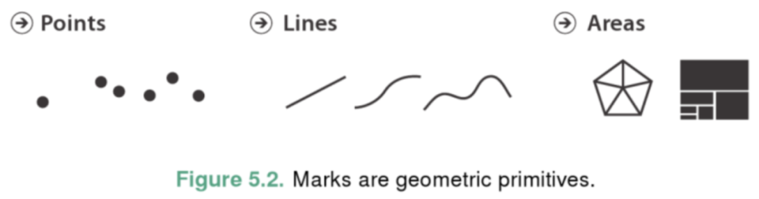
What are marks?
Marks are geometric shapes that are used in charts. The type of mark used is dictated by the data you want to display and the type of chart you end up choosing. Examples of marks are points, lines and areas.
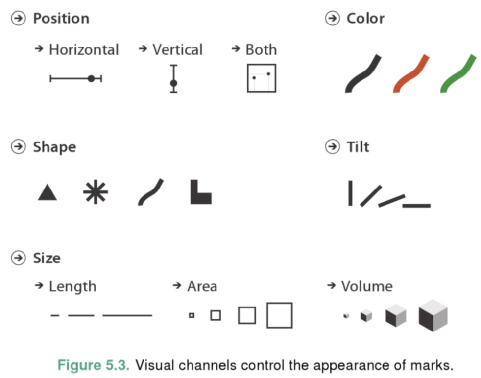
What are channels?
Channels refer to the properties of a mark that are modified in a chart.
Channels are not as effective when it comes to data visualization. This is because human visual processing interprets these channels with different levels of accuracy.
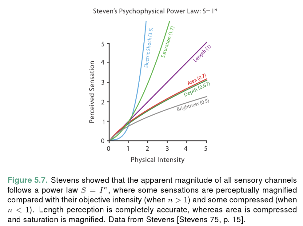
As you can see from the chart above, it’s easy to perceive the length of a mark to a high level of accuracy, but it’s a lot harder to accurately perceive other visual channels.
To put this into perspective, an area mark that’s twice the area of another is perceived as only around 1.6 times as large, but a colored mark with double the color saturation of another is perceived as being around 3.2 times as saturated.
Guiding principles
There are two principles that you should always keep front of mind when designing a chart - the expressiveness principle and the effectiveness principle.
The expressiveness principle
According to Tamara Munzner’s Visualization Analysis & Design:
“The expressiveness principle dictates that the visual encoding should express all of - and only - the information in the dataset attributes. The most fundamental expression of this principle is that ordered data should be shown in a way that our perceptual system intrinsically senses as ordered. Conversely, unordered data should not be shown in a way that perceptually implies an ordering that does not exist.”
The effectiveness principle
Visualization Analysis & Design also notes that:
“The effectiveness principle dictates that the importance of the attribute should match the salience of the channel; that is, it's noticeability. In other words, the most important attributes should be encoded with the most effective channels in order to be most noticeable, and then decreasingly important attributes can be matched with less effective channels.”
But which channels are most effective, and for what?
Fear not! We have some insight into this as well….
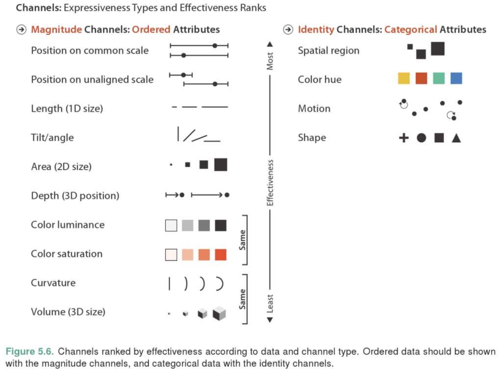
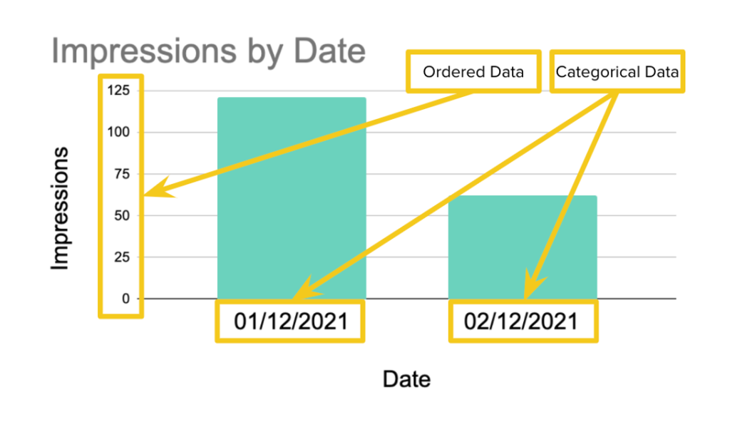
First of all, ordered data should be presented with magnitude channels, while unordered data should be presented with identity channels. Most of the tools that you can use assign these kinds of channels by default, so you don’t tend to think about this too much.
If you display point marks with two ordered dimensions on a scatter chart, Tableau (or GDS, Looker or virtually any other tool) displays these points along the x and y axes. This sets the x and y positions of each point to show the values of each of these dimensions.
A bar chart, on the other hand, may have one type of ordered data and one type of categorical data. In this case, the x position is used to distinguish different categorical groups. The height of the rectangular area of the marks use the y position, which measures the magnitude of the ordered data.
Extending this example, say you took the scatter plot, but in addition to the two axes of ordered data, you also want to display categorical group membership. The best way to do this is with the use of space. The idea being, if you were to take each of the groups and break them out into separate scatter plots, the viewer would be able to very easily tell the groups apart from one another and view the scatters for each group.
A drawback to this method, however, is that it becomes less easy to compare groups since they are no longer all on the same chart.
The next best way to display group membership is with a color hue.
(Side note: it’s important to keep in mind that color hue is inherently unordered. You might be thinking ‘but what about the order of the rainbow?’. The sad truth is, that order - ROYGBIV (red, orange, yellow…) - is learned, not inherent to our visual processing. Our brains don’t interpret them as ordered without active effort.)
So, on one scatter chart, you can color all points relating to different groups with varying color hues. While it might be a little more difficult to tell them apart than for groups made on separate scatter plots, it’s actually easier to compare groups to one another.
Overall, neither version is necessarily better than the other, it’s all dependent on what aspect of the data you’re trying to emphasize.
An example scatter plot
Summary
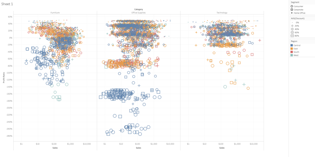
This example scatter plot uses x and y positions for ordered data and also uses the x position separation for the first major category. Color hue is used for the second major category and point shape is used for the third category. Finally, the scatter plot also uses the area of the points (2D size) to add an extra level of ordered data.
We’ll let you decide which information channels are easier to see and which ones require more work to pick out.
Before you start….
Next time you make a chart, consider whether you’re using the most salient channels to display the most important pieces of data. And don’t forget to always ask yourself whether there’s anything you can change to better emphasize your point and add necessary nuance.
If you’re interested in learning more about optimizing marks and channels for maximum impact in data visualizations, get in touch with our data solutions team.


